Map Stories – Eric John Photography

Suddenly Senior Sessions and Sales Were Down.

In 2011 Eric and Shawna Anundi faced a huge business predicament: Over the years, high school senior portraits had become a key aspect of Eric John’s financial success, representing over 50 percent of the studio’s business. Suddenly, senior sessions and sales were down dramatically. Shawna and Eric explains:

“Our senior marketing centered around a rep program that we launched each year with a big rep party. Typically this event would attract 100 seniors. The year before it had been great, but in 2011 only 30 students showed up, and we knew we were in trouble.

“We really didn’t know what hit us. We knew our sales would decline, and all around us well-known photography businesses were closing, and photographers we had never heard of were popping up. It was almost impossible to tell what was driving the market. We were determined to make it work. We have worked too hard to build this photography business to just close the doors.”

Recognizing that part of the solution most probably involved creating better marketing consistency, they figured they would have to hire a full time employee to be in charge of marketing.

At IUSA in 2012, the Anundis visited the Marathon booth to look at photography marketing materials.

“That’s where we learned about the MAP Program, and we decided right there to join. To us it was a no-brainer: We would get great photography marketing materials, and we would receive help from Marathon’s personnel as well. It also meant that we wouldn’t need to hire anyone.”

Together With Their Facilitator They Decided to Tackle Three Main Goals.


Refine Their Brand with Image Building Products

The first issue they approached with their MAP facilitator was refining their brand with a few fundamental image-building products. “We had a design going that involved some specific color choices,” Shawna explains, “and our designer added embellishments and a different tonality of blue that we were very pleased with because it improved the attraction to women, who are a large percentage of our clients.”

Eric says he now recognizes that he really did not know how their brand was looked upon in the community. By being more aggressive in their promotion to high school seniors, Eric was pleased to learn that the Eric John brand now has quite a bit of currency in the community, and apparently the new photography marketing efforts had served to bring renewed focus and urgency to that brand.


Reposition Website Based off of New Designs

Eric and Shawna decided to take advantage of the free website and hosting that is included with their MAP membership. The design and elements that were created for printed pieces were carried over to their new Marathon Website to create brand cohesion. Information pages were reviewed to make sure that it generated enough interest to call and book sessions.


Create a Senior Rep Program

Next, they tackled the high school senior problem by moving from a rep program to a “models search” promotion that would be launched on Facebook. The expectation was that it would create an opportunity for many more students to book a free session early in the year. After reviewing a Marathon video that explained how to work the entire promotion, Eric and Shawna did have some initial concerns.

At first, Eric was hesitant about the promotion because he feared it might attract students who didn’t fit the typical profile of his high school senior clients who appreciated the quality of the photography his studio provides. Much to Eric and Shawna’s delight, the students who responded proved to be just as enthusiastic as those who booked their sessions in response to the studio’s typical photography marketing. A new high school senior photography marketing “magazine” and photography marketing card also helped to generate interest in their high school senior offerings.

“We were expecting to get only 25 students in February, and over 60 responded, which was a great start for our high school senior season.”

“We’ve learned a lot through this process,” Eric concludes. “We’ve always known that the photography business can have its ups and downs, but now I believe we are a lot wiser about knowing how to handle these changes. With the MAP Program behind us, will be a lot quicker to ask for help and a lot more willing to try different directions as our photography business grows and changes.”
Show and Sell

You sell what you show. Furniture stores have living room areas set up, complete with accessories, to get you inspired. Make sure you have a wall grouping to give them ideas and inspire them to purchase one of your larger packages. Show people how lovely your images incorporate with their decor.

Creativity Through Branding

Creativity is what makes you unique, original and interesting. It’s the next step you take after being inspired. It’s the day dream of taking an ordinary idea, product or marketing piece and making it stand out from your competition. We see examples of it all around us. Just look at the clothes we buy, the computers we own, and the cars we drive.

Creativity through branding is especially apparent in Apple products. It wasn’t enough for Apple to have great computers. They also had to look beatuful and get people 100% bought into their philosophy. This concept has made their brand very unique. It even comes through in their commericals on TV.

Apple’s Commercials:

  • Never mentions a price.
  • Never offers special savings.
  • Consitant advertising.
  • Plays on emotional experience.

This needs to come across in your content too. People pay more for an experience. Look at Disney World, Las Vegas, fine dining and concerts. We could easily eat in and stay at home, but people like an experience. They’ll spend extra money on an experience because it’s memorable.

happy-money

What experience can you provide that will create a buzz?

For example try offering a variety of gourmet coffees to enjoy. Or create a themed lounge corner in a corner of your studio to hang out. Bring in a chef to teach a cooking class in your home.  It doesn’t have to be expensive or complicated, but it does have to be memorable and fun!

Ask yourself these 3 questions:

  1. Is my brand fresh and relevant?
  2. Do all my materials appeal to my target audience?
  3. Does my brand carry through in all of my materials including my facility?

If you’ve answered no to one or more of these questions, you may find that it’s time to rebrand your business. If that is the case, I invite you to download the free copy of “The Branding Difference” 

Thats it for this month! Mark Weber

signature

Easily Create an HDR Image

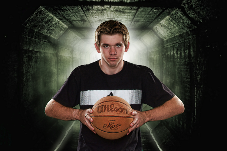
Have you ever been in the mood to create something different? Offer a session that goes a little beyond the norm? There are a lot of different styles of photography that motivate me, and looking through the PPA Loan and Show books always inspires my imagination. So when it was time to photograph my nephew Anthony for his senior portraits, I decided to use this technique on a couple of his photos.

Most of the images were done on location using traditional methods of light modification, but the HDR look was applied to all of them in order to achieve a stylized look that only comes from a handful of software programs. For the examples shown below there is also a lighting diagram for you to better understand how it was accomplished technically. All post-production work was done using Photoshop CS5 & Topaz Adjust – www.Topaz.com. You can get pretty close using only Photoshop’s HDR filter, but Topaz is incredible and much more versatile in my opinion.

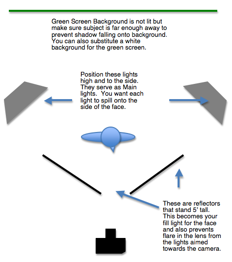
The main light is from the 2 lights, each in a 24“ softbox on either side of the subject, placed about 4 feet behind the subject. It was about 2 feet higher than the top of my subject’s head and angled slightly away and down from my subject. The light hits the side of the face from each side and sets the mood for a dramatic portrait, since this is not your typical lighting pattern used to show off a “nice and pleasant” portrait. In Anthony’s case, he loves basketball and takes it seriously (and he’s good) so it was just the look we were after. Plus, the light from this angle also provides a hair light as it wraps around the entire back of the subject.

Diagram

Fill Light – depending on how dramatic you want to make this, you can even skip a fill light, but I wanted to still see his face and have his eyes stand out. I used a reflector on each side of him and angled them so they would kick enough light from the main lights toward the back sides to bounce back into his face in order to bring in some detail in the shadows and yet keep the mood. The key is to feather the light onto the subject and also into the reflectors to catch a nice bounce into the shadow. With reflectors, what you see is usually what you get. They also prevented lens flare in my camera since the lights were aiming back at me.

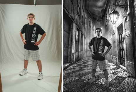
Background – You can use just about any solid color background you want because you are going to remove it in post-production. You just need to make sure it’s evenly lit (or unlit). I used a green screen cloth fabric in this image, but I have also used a white background. You can also create this look using an existing background on location.

1

Replacement Background – You can use any background you want. Something you’ve shot from another scene or maybe it’s from a design generated digitally.  It’s all up to you!

Image-3

Post-Production – You will need Photoshop to remove and add the new background, and Topaz Adjust will give your image the HDR look you want. This software is truly amazing, so be sure to check out their site at www.Topaz.com to see what I mean. You can even download a 30-day trial for free and it’s Windows and Mac friendly!

Your imagination is your only limitation!  Hope this inspires you to go try something different today.

Mark Weber

signature

Marketing Excercise

Try this exercise to help identify your target clients and other businesses to network with. Also get a greater understanding on what your clients want and value.

Create an imaginary client. She is one of your favorites and always spends a decent amount on her portraits. Firstly give her a name and think about what she looks like. Answer the following questions:

  1. Where does she shop?
  2. What are her hobbies?
  3. What doctor/dentist does she see?
  4. Where does she volunteer at?
  5. What kind of photos does she value?
  6. What does her house look like?
  7. What would she carry around in her purse?
  8. What would she like to put on her desk?

Mark’s Favorite Things – Apps, Gizmos and Gadgets

Hi Everyone, Mark here at Marathon Press bringing you tidbits of information and helpful hints to help you grow your business. This month I have a little different message. It’s my end of summer Top 10 Best of List so far this year. It contains some of my favorite things that either makes your life easier, better or just plain more fun!


#1. Woody’s Free Photoshop Tip of the Week

Woody’s free Photoshop Tip of the Week. Woody Walters is one of the most creative and talented photographers out there. He has some of the coolest Photoshop brushes and has a weekly Woody’s Free Photoshop Tip of The Week”that comes out every Friday.

Woody has a quick video to explain some creative techniques he does in PhotoShop and makes it easy to understand.

Check Out Woody’s Free Tip of the Week Link Here


#2 Animoto

Products – Animoto – Make great videos easily using your still or video images. It’s never been more convenient to create high quality shows quickly.

Check Animoto Out Here


#3. Topaz Labs.

Anything by Topaz rocks. You can’t be a photographer without one or all of these plugins. I own them all and I’ve tested many other plugins but have found none better or more intuitive than what Topaz offers.

Plus they are very affordable and they offer free trials. Your mind will be blown at the possibilities what you can do artistically as well as the practical side of fixing things.

Check Out Topaz Labs Here


#4. MAP Program

Want the best marketing program that has product as well as support? Look no further than Marathon’s MAP Program. With the ongoing help of your own Facilitator to help you create a custom marketing plan that fits your personality and budget, you’ll never be wondering what to be doing about your marketing. They keep you accountable and enthused about your marketing.


#5. Sticky Albums

This has become what wallets once were to high school seniors. Create digital photo albums that can be shared. Available as a mobile apps that clients can save to their iPhones, iPads and most Androids. This is the modern day wallet for many people.

Check Out Sticky Albums Here


#6. PPA Certification

Set yourself apart from the competition and gain more confidence in yourself when you become a Certified Professional Photographer. It takes a lot of studying and solid photography skills to pass the exam but it’s worth it.

You’ll be able to market yourself as part of an elite group of photographers than can call themselves Certified.
Get Certified Here

Check out the link to Quizlet too. It will give you an idea what is on the exam and help you get prepared. You’ll learn thru flash cards and practice tests.


#7. PortraitPro 12

The fastest, easiest retouching software & so much more. You just have to see it to believe it. It’s very affordable & often on sale. You can download a free trial too! Check out the video link and their page.
Portrait Pro 12 Website
PortraitPro Demonstration Video


#8. Go Pro Cameras

They have 3 versions. Get the top of the line Black Edition. They aren’t that expensive and the price differences aren’t that much.

The cameras are small and compact. Their uses go beyond just sports and adventure stuff. More and more photographers are finding a new style & service with this type of camera. Check it out on their website at the link in the blog..

Check Out Go Pro Here


#9. DJI Phantom Copter Pro II

To go with the GoPro camera, check out the DJI Phantom Copter Pro II You can get as fancy as you want with these. They can be the bare basic to an onboard video monitor that puts you in the drivers seat with a live view with the remote screen attached to your controller.

You’ll get some incredible arial views that previously required a helicopter or airplane.

Check the Kit Out Here

Take a few minutes and check out the video posted on Youtube about a lost Phantom. You’ll get a chuckle out of it.
Funny Video on lost Phantom


#10. Note Taker HD

Get the app called Note Taker HD. You know all those notebooks you have that are filled with little ideas or shorcuts to a PhotoShop path or simply a phone number you wrote down but now can’t find. Those days are over.

With this app you can draw, write, type, insert a photo, draw on a photo, erase, save, organize and send your files to anyone you want.

Essentially, you can do anything you can do on paper only way more. It has saved me hundreds of sheets of paper over the year and I can now find what I’m looking for quickly because its organized and all on my IPad!

It’s 5 bucks and you’ll thank me for this especially if you can write faster than you can type.

Check Out Note Taker HD Here.


That’s it for now. This is your old pal Mark Weber saying so long. I’ll see you in September!

signature


Build Your Own Softbox

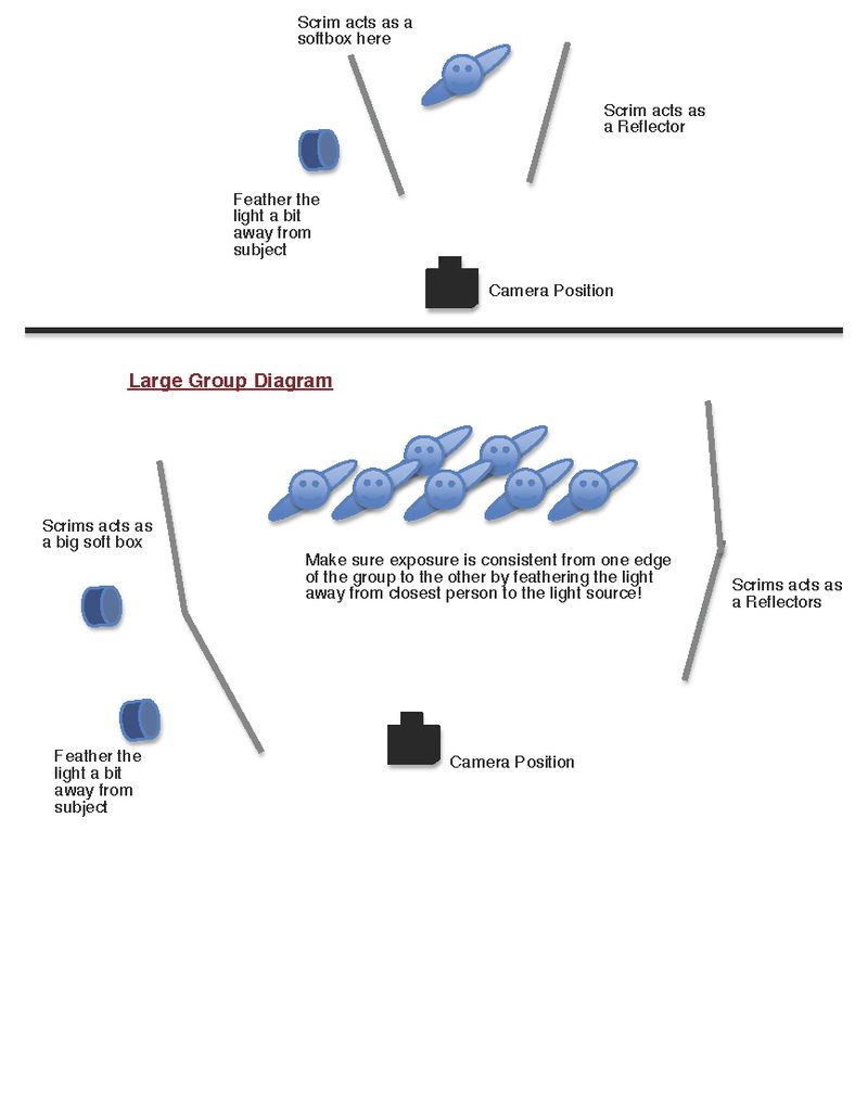
Are you in search of a portable and less expensive soft box to use while you save up enough money for the professional brand? I have created many of my own DIY soft boxes over the years and you can too. You can make them any size and they have multiple uses!  A DIY soft box can serve as a light diffuser/modifier, a reflector and the substitute black rip-stop fabric doubles as subtractive
lighting.

I like to use this DIY soft box indoors and out. If you have a breezy environment, the 1” PVC tubing is more rigid than the ¾” tubing. You also need to decide if you would like one that is portable. You don’t need to glue the PVC since it sticks together pretty good unless you get into a windy
situation.

The nice thing about the white rip-stop material is that it’s extremely durable. It doesn’t rip easily and if you happen to poke a hole in it, the hole won’t get bigger. The fabric is lightweight and diffuses just enough of the light to make it soft, but not so much that you loose too much illumination.

So, what else can you use these panels for?

  • Shoot a strobe through them to serve as a large soft box.
  • Hold them over a subject’s head to diffuse the mid-afternoon sun.
  • Switch out the white fabric for black and use them for subtractive lighting.
  • Peel down a corner to let some of the light spill out on your background or subject depending on the look you’re after.
  • Hang the frame with black fabric on your wall to keep light from bouncing in your high-key area.
  • Use it as a gobo between you and your subject to prevent lens flare under certain circumstances.
  • Simulate north window light by combing 2 strobes and 2 soft boxes side-by-side. A 7’x8’ soft box can be very pretty.

You won’t have the light head contained in this setup, but that’s okay. Even though it’s not as efficient as a covered head, it still makes a wonderful modifier.  You can experiment with how far to position your strobe from the fabric to fit your taste. I tend to keep mine 3 or 4 feet back, sometimes more. I like to angle the strobe head slightly up from the floor and away from my subject.

There is a more professional (complex) way to build these panels.  Dean Collins first introduced these designs back in the 80’s. Here is a link to get Dean Collins Tinker Tube instructions – http://www.software-cinema.com/page/13/tinkertubes. My instructions are more simplified, but they fit my skill level and patience. While it’s not as fancy, you can build it in no time and be ready to use it quickly. Here’s what you need:

¾” PVC/40 Pipe
Available at any hardware store (you can also use 1” if you prefer. Just substitute all sizes
accordingly. If you plan to use them outside, I would recommend the 1 inch.)
5 – ’¾’ PVC/40 Pipe
L = 8’ (source for all straight pieces)
4 – ¾” Elbow 90 degree PVC/40 for corners
3 – ¾” Tee PVC/40 for connectors
1 – ¾” connector to connect 2 straight pieces

Fabric – To slip on the frame.
Rip-stop Nylon (white)
http://www.amazon.com/Vogue-Fabrics-Stop-Nylon–White/dp/B006ZE3OOO/ref=sr_1_16?ie=UTF8&qid=1358201541&sr=8-16&keywords=ripstop+nylon

Elastic Straps – To connect the fabric to the frame. You’ll need to glue elastic to the each of the
4 corners of the rip-stop fabric at 45 degree angles about 7 inches from each corner.  This allows you to quickly attach or detach your fabric.
4 – Elastic Straps
http://www.walmart.com/ip/1-1-2-Heavy-Waistband-Elastic-White/19767423

Fabric Glue
Adhere the elastic with this glue. Only glue the ends of the elastic onto the fabric!  Any permanent
fabric glue will work. Look for a bottle similar to this  – http://www.allstitch.net/product/fabritac-permanent-adhesive-large-10-oz-bottle-3813.cfm?aid=FABTAC-8&sid=googlebase&gclid=CLqBzejr6LQCFSemPAodtxcAWg

PVC Cement – Use this to make your pipe connections permanent. I tend to leave the corners
unglued so I can break it down for easy storage or portability. I lay my pieces on top of one end of the rip-stop material and roll it up. The elastic straps can keep it all together.

Saw –I use a regular back saw with a miter box to cut the pipe.  Here’s a link that explains different options –http://www.hammerzone.com/archives/plumbing/technique/pvc/cutting/sawing_pipe.htm


softbox-1

softbox2